With A bachelor’s degree in interior design behind her and a career spent helping investors and homeowners to maximise their properties’ appeal, Justine Stedman isn’t exactly a novice renovator.
As the director and principal stylist at Vault Interiors and the daughter of diehard DIY renovators, Justine has property restoration in her blood.
“I grew up around property and learnt from an early age that properties with potential were the ones to hunt for,” she says.
“Whether the renovation is undertaken to suit the general public, or a custom job for a homeowner, what’s great about renovation is that you customise the look and feel, manage the budget and also make a good return also.”
“I got a bargain because I think prospective buyers were put off by the poor presentation”
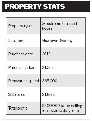
Or in some cases a great return, as Justine found when she took on her most recent project, in which she walked away with a whopping $400,000 profit!
“The market enjoyed a surge, and demand for the street we lived in peaked, so it was a good time to sell and capitalise on the property’s position,” she admits.
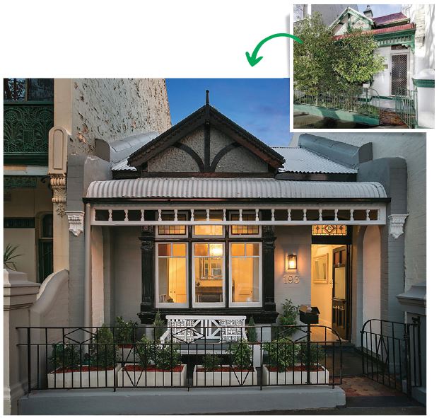
Initially, she says the property caught her eye because it was “the worst house in one of Newtown’s leafiest and prettiest streets”.
“It was opposite a big park, a block from the carriage work markets, and had a local cafe on the corner. The home was also a two-minute walk to King Street, which has enjoyed a live in more desired areas. It’s been a fun journey with many trials and rewards along the way!”
The curse of poor presentation
This renovation project commenced when Justine stumbled upon a property that was so poorly presented that other buyers were turned off.
“But I got a bargain because I think prospective buyers were put off by the poor presentation and obvious renovations that were needed to make it really inviting and liveable. It had been a rental property for many years and was rundown and not well maintained.
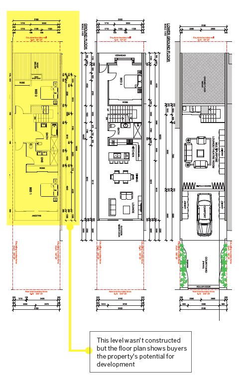
“The home had good bones already and it could be completely structurally altered at a later stage if desired, to add bedrooms and go up a level. The renovation I undertook was more cosmetic than structural.”
Justine’s $65,000 renovation took around 12 months and consisted of:
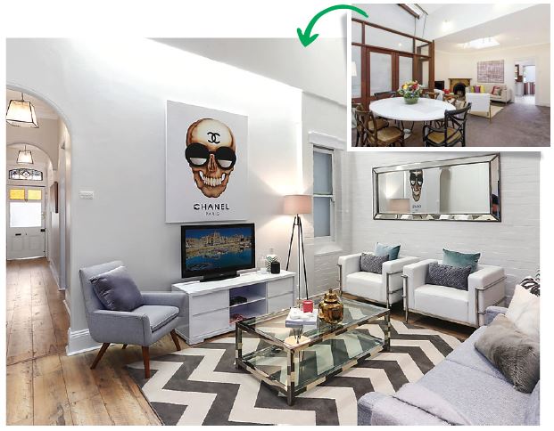
Replacing the kitchen: “I replaced the old worn kitchen with a nice IKEA kitchen, and I brought the facade back to life in a paint scheme that highlighted the property’s beautiful and decorative period features.”
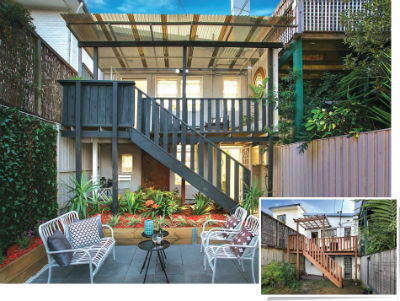
Refreshing the walls: “I painted the entire property throughout, both internally and externally, including the back deck.”
Installing floating floorboards: “Floating floorboards and new carpet were installed throughout the home.”
Adding new storage: “I installed wardrobes and an inbuilt study nook to maximise storage and function in the master bedroom.”
Landscaping: “I did a fair bit of landscaping, which included half-paving/half-turfing the garden so it could be multifunctional and be utilised as an outdoor entertaining zone.”
Adding living space: “I added value by converting a dark and dingy room under the back deck, which had only been used as a laundry previously, into a functional study nook and multifunctional space. This meant we gained a room.”
Creating street appeal: “Trimming the front bush so you could actually see the lovely home and let the beautiful period details shine out was a major win – it gave the house real street appeal.”
Final touches: “Changing small details throughout the property made a big difference, such as installing pendant lights, new curtains and door hardware to make the property feel fresh and well maintained.”
Of course, one of the final pieces of the puzzle was when Justine put her own skills to good use by professionally styling the finished product.
“This is mainly because it creates an aspirational living scenario that buyers do not get if the home is full of clutter or too many personal effects, as it makes it harder for them to become emotionally attached to a home that is poorly presented.”
For those who are keen to follow in her footsteps, Justine suggests you keep it simple and have a clear plan for what you want to achieve from the outset.
“My advice is to keep things simple: choose a neutral base colour scheme and apply it throughout the whole property.
This applies to the wall paint, carpet, kitchen and bathroom fi nishes. That way the house will feel tailored and considered. Beige or grey tones are the most on-trend colour schemes right now,” she says.
“The biggest mistake in general to make when renovating for sale is to overcapitalise and spend too much, especially on details that are taste-specific and therefore may not appeal to the broader market.”
While Justine is thrilled with the result she achieved with this property and has plans to renovate again in the future, she’s not ready to dive into another project just yet.
“Even though it can be very stressful, messy and it’s lots of hard work getting it all done on budget and in time – both mentally and physically – it’s always worth it,” Justine adds.
“I’ve done a few in a row now, so I’m enjoying a little break!”
OUT-OF-THE-BOX MARKETING TIP
“We had a proposed full renovation floor plan drawn up so that buyers could see future add-on potential,” says Justine. “When we renovated, it was cosmetic only, so we didn't undertake these works; however, I think showing how to further add value did get more buyer interest. A development approval or concept plans like this can be a great marketing tool when selling, and it is worth the money to have it drawn up by an architect.”
