The kitchen is the life source of a home, so it’s only natural that, as the main hub, it’s where a renovation can make the biggest impact. In renovation terms, a kitchen is also the one area that can chew through your budget – fast!
Jane Slack-Smith from the Ultimate Guide to Renovation says the key to a successful and profitable kitchen renovation is to look down the street.
“Before you start ripping out your existing kitchen you need to look at what’s going on in the suburb around you, because you don’t want to be overcapitalising in a property and renovating to the tastes of the wrong demographic,” she says.
“You need to head out and see how the other houses in the area have been renovated. For example, if most of the houses have a glass splashback instead of tiles in the kitchen, then you too should use a glass splashback – it’s about meeting the benchmark, rather than exceeding it.”
Renovating a kitchen is about understanding who the kitchen is for and creating a space that is functional, comfortable and timeless. Jane’s secret weapon is the kitchen work triangle, which defines the amount of space to be allowed between the kitchen’s three main zones: the stove, sink and fridge. Over the following pages, Slack-Smith shares her best tips for making over a kitchen with maximum impact and minimal outlay.
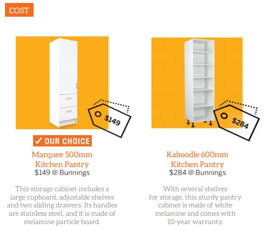
Small spaces are difficult to work with, but large spaces can be hard to fill as well. You want to maximise the available space without making it look too cluttered.
If your kitchen is quite large, you may want to consider installing a butler’s pantry. This extra concealed area not only helps by creating additional storage and prep space but also adds to the overall perceived value of the kitchen. A modern butler’s pantry serves as a bridge between the kitchen and dining room, and it generally has countertops and storage spaces for tableware.
Top tip
You can also use a pantry cabinet as a decorative element. Arrange your best tableware and linens stylishly in the cabinet behind a protective glass door or clear panes.
Going big can enhance your ability to entertain in the kitchen. The kitchen island is the gathering point in the room, so making it oversized will help with function and aesthetics.
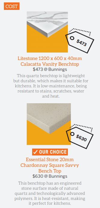
You may want to consider using the entire sheet of stone for your benchtop, rather than trimming it down to size. Not cutting it down can save on costs!
Stone benchtops, while expensive, are great for kitchens, given their remarkable durability and beautiful, elegant look. If you’re on a budget, however, there are benchtops made of laminate that emulate the look of stone. They may not last as long as stone, but they are also reasonably durable.
Top tip
Branded products often seem more trustworthy at first glance, but generic brands can be just as good as name brands like Caesarstone – and you can get them for two thirds of the price.
Step three: Make the taps shine
Tapware adds crucial appeal, not just from a functional standpoint but also in terms of design.
Shiny sells, so tapware with a nice chrome finish is a great choice as it’s modern and won’t date too quickly.
Chrome taps are easy to polish – you can use a microfibre cloth and water to wipe the tap down every day and keep scum from building up. Even if your style leans more towards vintage, there are chrome taps designed with a vintage flair that would suit this aesthetic.
Top tip
If a lot of deposit has built up on a chrome surface and you would rather refrain from using chemicals, lemon juice is a great alternative – simply put it on the area and leave for an hour before wiping off.
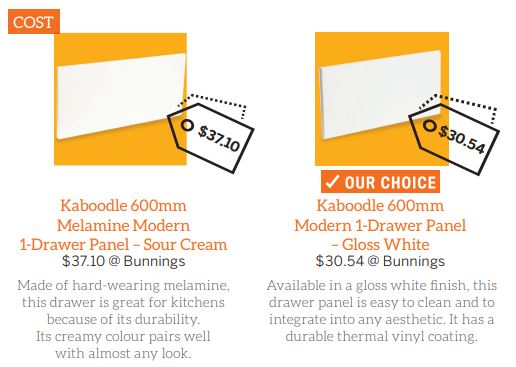
The value of a kitchen increases with the amount of storage space it offers, which is why drawers are often a better choice than cupboards.
Modern kitchens have a lot of drawers because they make the best use of space and are easier to access than cupboards. Drawers are ideally positioned low down so that you can store heavier items like pots and pans in an organised manner.
Use drawers at the base level and save the cupboards for your overhanging storage. Consider going handle-free and opt for a high-gloss white finish for easy cleaning.
Top tip
Oil and dust residue can spoil even the glossiest finish. Keep drawers looking pristine by regularly dusting and wiping to get rid of any sticky grease that will collect grime.
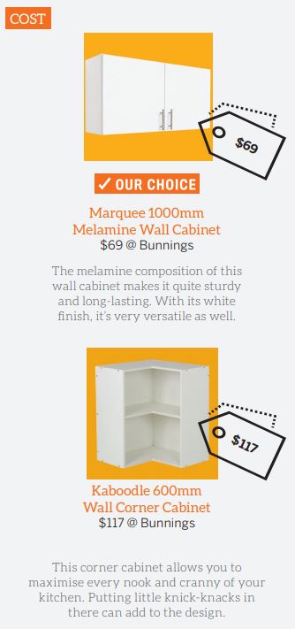
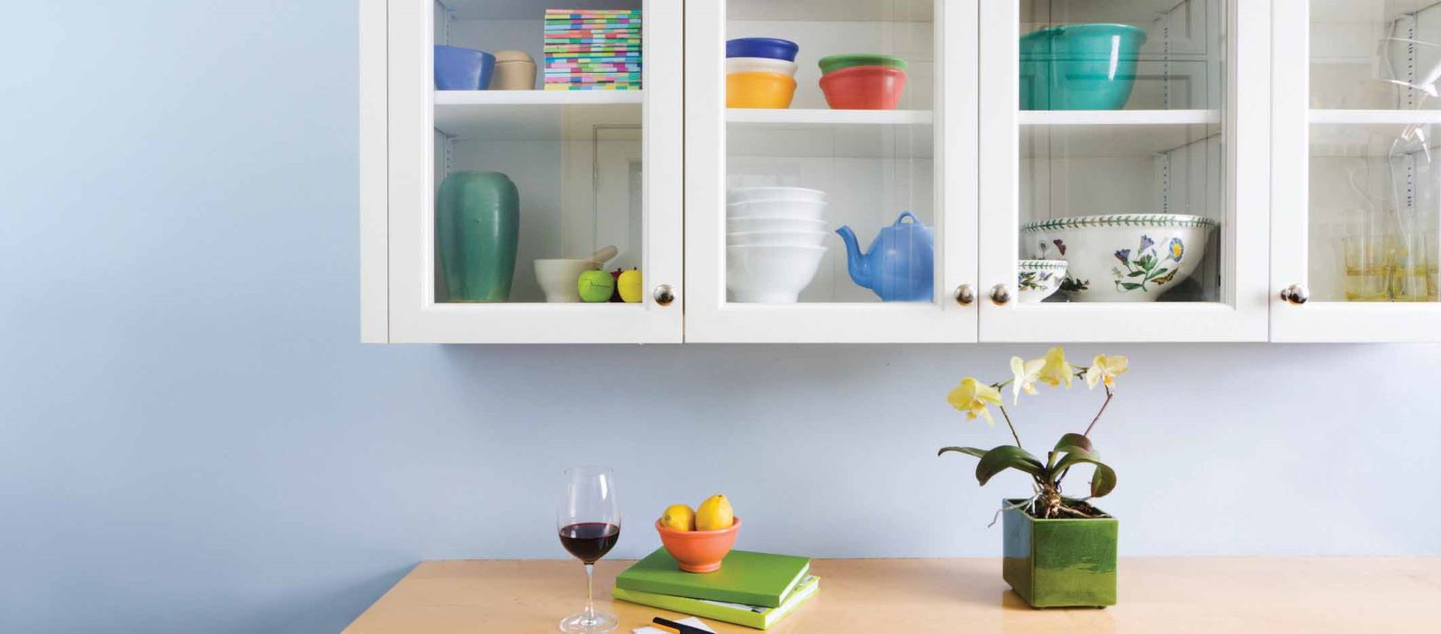
Aside from providing additional storage space, cabinets give you a chance to play up your kitchen’s look. Glass cabinets let you show o your good china and tableware, and cabinet doors painted in a contrasting colour can add depth to the room.
You also don’t have to strain your budget to fi t good cabinets into your kitchen. Using prefabricated rather than custom-made cabinets will save on costs. There are fewer options to choose from, but you can fancy up the rest of the space with other design elements.
Top tip
Wall cabinets give you more surface area to work with without sacrificing storage space. You can spice up a glass cabinet by adding patterned mesh for texture.
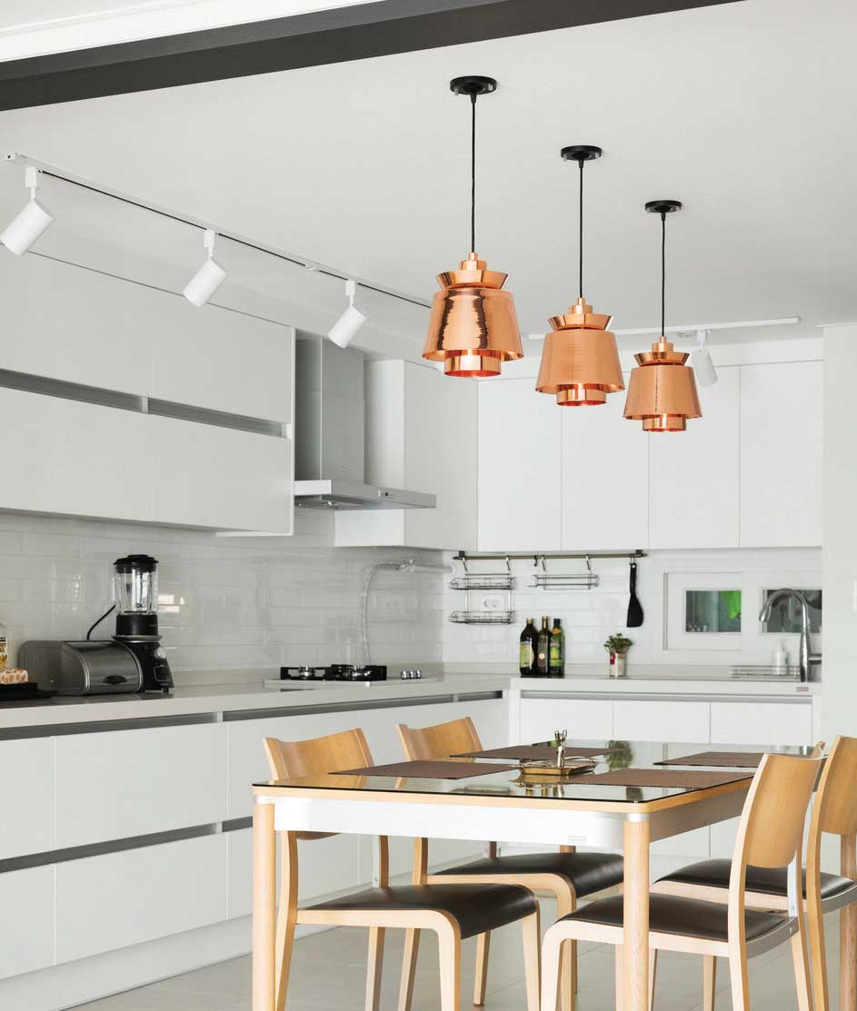
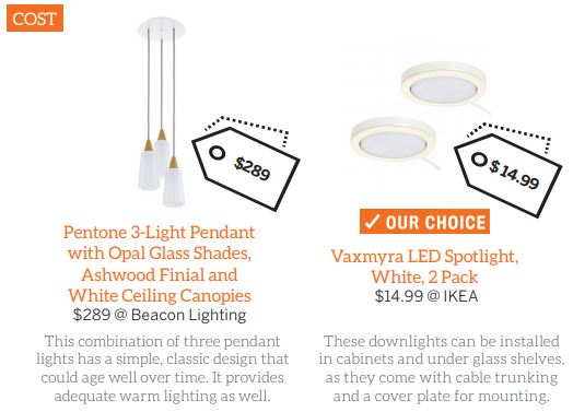
Good lighting sets the mood in a kitchen. If your target demographic includes kids, you need to make sure they have ample light if they’re using part of the room as a homework space.
Often you will see pendant lights over the island bench to ‘zone’ the space and set a nice tone; however, this could mean overcapitalising in this area. Like most on-trend items, pendants can collect dust and look so ‘yesterday’ in a year or two, so keep it simple. Downlights are a great choice and can even be installed under the overhead cupboards.
Top tip
“Windows are also important and you should always use natural light wherever possible to breathe life into the space,” Slack-Smith advises. Floor-to-ceiling windows let in a lot of light and offer a wonderful view, and if the target market has small children, this is a very popular feature, as it allows the parents to watch the kids out the back while they’re in the kitchen.
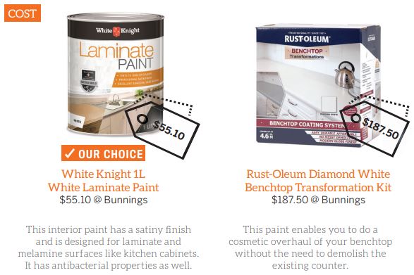
Painting is the cheapest and COST fastest way to freshen up your kitchen space. If a total reno is out of your budget, then a facelift can be achieved for less than $500 if you choose to paint the benchtops and cabinets.
New paint can instantly make an older fixture look like new again, as well as modernise its design. If the original shade is a bold colour, you can take the opportunity to tone it down with a lighter shade, like white or cream, to achieve a minimalist look that has more universal appeal.
Top tip
Paint isn’t the only way to go. Updating the handles on your cabinetry will also help modernise the kitchen and can be a cheap way to update the look every couple of years.
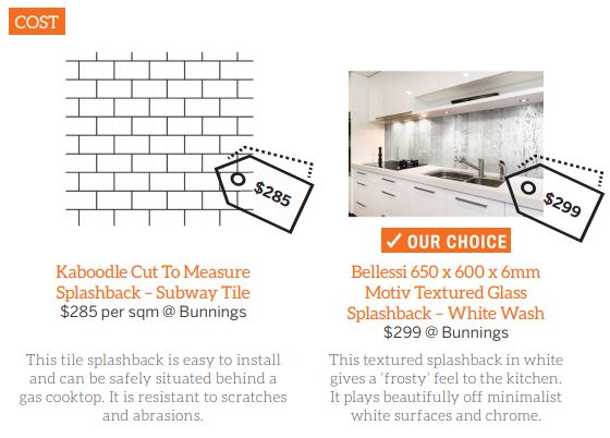
A stunning splashback can act as COST the centrepiece of your kitchen when done right.
Popular options are to use a window that gives you a view into the garden, or a tinted mirror or glass.
Windows let you emphasise features outside the house as a piece of natural art, whereas mirrors can reflect the best of your interior design. However, they must be cleaned and maintained regularly so they don’t look dirty and cloudy. For easier maintenance, tiles are another option.
Top tip
Tile splashbacks can double as artistic instalments, for example by using mosaic tiles that can be put together into beautiful designs. But it’s just important to ensure that the tiles used can withstand the rigours of a kitchen.
CASE STUDY
Tanya and Craig took on the challenge of transforming a dark, cramped and floorless 1920s kitchen into a bright, airy and functional space by choosing the right colours and having the right people on their team
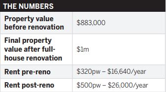
Tanya and Craig decided to renovate their 1920s California-style bungalow to improve their rental return and increase their equity. It wasn’t all smooth sailing in this Ringwood refresh, but the result – an annual $10k rental boost – was worth it.
“When we got to the kitchen, we realised that underneath the kitchen cupboards and bench there was no floor!” Tanya explains.
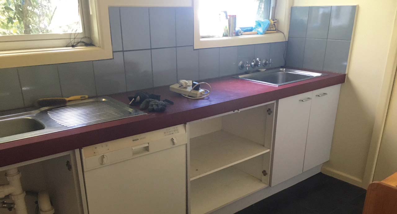
Before
“The kitchen was dark and claustrophobic. The walls were a dirty yellow colour, complemented by maroon-coloured lower benchtops and black vinyl flooring. The only window was covered with plants, so there was very limited natural light in this dark kitchen.”
Tanya and Craig lifted the space by choosing light, neutral colours. They also opted to leave out the island bench as there was already sufficient storage – this way, the tenants could pop in a dining table instead, giving the illusion of a larger area.
“We knew the appliances and cabinetry would cost us the most, so we started out by visiting a well-known showroom that had all the appliances on display. From there we made a shortlist of the items we wanted and went searching for them at cheaper stores. We had written quotes and asked each retailer to beat the quote until we found exactly what we wanted at the right price.”
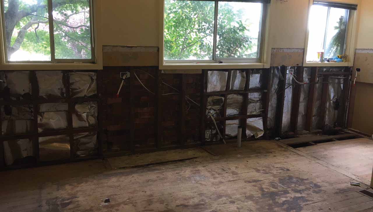
During
Because the house was built in the 1920s, none of the walls or floors were very straight, which added to the overall cost.
“We had to choose custom-made because using the stock-standard flatpack would really not have achieved the look we were aiming for. Spending a little extra here means we can confidently ask for more in rent,” Tanya says.
The same was true when it came to hiring expert trades.
“We had to change around some pipes after our plumber told us the current configuration could lead to leaks in the future,” Tanya says. “The last thing we wanted to do was rip up a brand-new kitchen later down the track!”
After
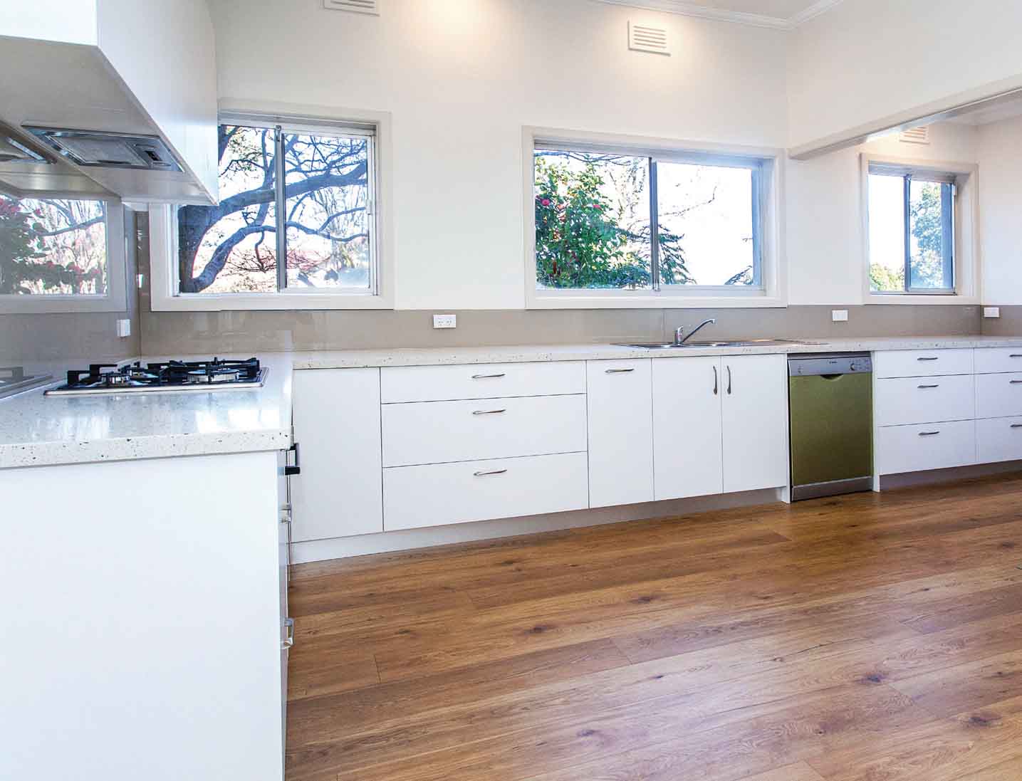
They opted for oak-coloured floating floorboards, a Caesar-look white-speckled benchtop, white cabinets with cupboards and drawers, stainless steel appliances and a neutral-coloured glass splashback. The finished kitchen is light and airy, and would attract any keen family cook!

media commentator and creator of the
FREE video course: How to Find, Renovate and Profit from Run-Down Properties.
Disclaimer: All products and prices listed are correct at the time of printing. The advice contained in this article is for general information only and should not be taken as financial advice. Please make sure to speak to a qualified professional person before making any investment decision.


