Expert Advice with Jeremy Sheppard 20/06/2018
Up until a year or two ago, there was not much positive talk about Hobart. Big items on a naysayer’s list included: low population growth and a backward economy. Now that Hobart has popped to the top of the growth charts, everyone wants to claim they picked it … including me.
Historical growth
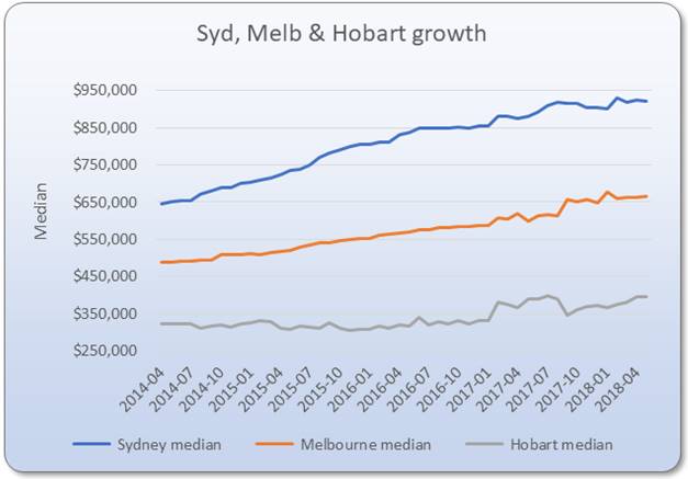
Putting things in perspective, the first chart shows how the growth played out for Hobart and a couple of other cities you may have heard of.

As you can see from the chart, Sydney was booming up until about the end of 2017. From early 2014 to the end of 2016, Sydney stacked on more than 30% to its median.
Melbourne did pretty well over the same time-frame too, piling on a total of more than 20% growth.
But Hobart was flat as a run-over-rat for the same period. It actually dipped in value for a year. Hobart prices weren’t even able to keep up with the rate of inflation. The total growth from early 2014 to the end of 2016 was around 2%.
Since 2016 however, Hobart has led the charge racking up 20% growth while Sydney and Melbourne have had 8% and 13% respectively. And the difference between the big two and Hobart has been even more pronounced recently.
Timing is everything
If investors had some equity and a crystal ball, they would have bought in Sydney or Melbourne in 2014, even earlier in the case of Sydney. Then around the end of 2016, they would have moved their equity into Hobart.
In April 2014 you could buy two properties in Hobart for the same price as one in Sydney. But 2014 was definitely a year to be buying in Sydney, not in Hobart, despite how affordable Hobart was.
If an investor bought in Hobart instead of Sydney in April 2014, they’d be looking at a whopping $200,000 opportunity cost by the end of 2016. “Opportunity cost” is the cost of missing out on a better alternative investment compared to the one you picked. It kinda puts in perspective how valuable good advice can be doesn’t it.
That $200k opportunity cost came from simply picking the wrong city – or the right one at the wrong time. Before you go asking your accountant, you can’t claim opportunity cost as a deduction on your tax return.
Late 2016 or early 2017 would have been the best time to buy in Hobart. It might have been a little late to capture all the growth from the start of its cycle, but any earlier would have robbed investors of the remainder of growth still finishing off in Sydney.
How I pick a hottie
I use supply & demand to tell me which market to buy into and when. If demand exceeds supply, then prices should rise. Once supply catches up with demand, then it’s time to look elsewhere.
The key tool I use for this concept is the aptly named, Demand to Supply Ratio. It’s a big-data algorithm that considers all sorts of well-known indicators like:
• Auction clearance rates
• Vacancy rates
• Selling times
• Stock on market
• Discounting
• And more
But it also considers a few more novel metrics like:
• Ripple effect potential
• Market cycle timing
• Neighbour price balancing
• Unit to house value comparison
• Percentage of open inspections
• And more fancy statistics
What did I pick in 2014
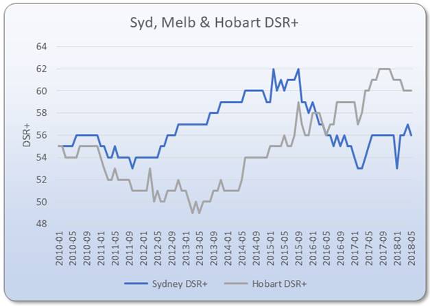
In April 2014 the DSR+ was undoubtedly picking Sydney. You can see this clearly in the second chart that plots Sydney’s demand to supply ratio alongside that of Hobart’s.

Sydney’s demand to supply ratio started climbing from a “balanced” position in early 2012 to over 58 in late 2015. A DSR+ of 58 means “well above average”, not just above average, well above average. For an entire city to have a DSR+ well above average is a clear indicator of coming widespread growth.
In 2014 I remember reading a couple of high profile experts warning investors to stay out of Sydney. They said it was too hot. But Sydney boomed in 2014 and that boom continued into 2015 and across 2016 as well. A few of these experts suggested Brisbane as an alternative. But Brisbane’s growth since then has been dull at best.
Picking Hobart
According to the DSR, Hobart didn’t trigger a clear “buy” signal till late 2016 when it scored 59 for the last 3 months in a row. At the same time, Sydney’s DSR+ came down to the mid-50s which is about average for the entire country. A score in the mid to low 50s represents a market in which supply and demand are balanced. The vast majority of markets around Australia are in a state of balance most of the time.
The two curves on that second chart show that investors had an indicator telling them to move their money out of Sydney and into Hobart somewhere around late 2016 to early 2017.
Future gazing
When demand exceeds supply, prices rise. And right now, demand exceeds supply in Hobart. That means prices should keep moving upward. Eventually the higher prices will subdue demand. It’s not clear how long that will last, but I expect to see more price growth in Hobart over the rest of this year.
By the way, according to the DSR, Hobart isn’t the only city you’ll see experiencing above average capital growth this year. Keep your eye on Adelaide for example.
Right now there are hot suburbs in almost every state capital around the country. Many of those suburbs have DSRs well above the dizzy heights of the city averages for Sydney and Hobart recently. Despite talk of a flat market, there are plenty of opportunities for investors, even if there is no stand-out city.
Conclusion
So, there you have it: I picked Hobart and at just the right time too… like everyone else?
....................................................................................
 Jeremy Sheppard is head of research at DSRdata.com.au and LocationScore, both are specialist property investment research company that provides research software platforms in the Australian property market. He’s naturally an active property investor and a self-confessed property-data nutcase!
Jeremy bought his first investment property in 2002. By 2009, he had amassed a portfolio of 16 properties in both Australia and New Zealand. Some of his purchases doubled in value in less than 3 years without any renovation, subdivision or development.
DSR data can be found on the YIP Top suburbs page.
Click Here to read more Expert Advice articles by Jeremy Sheppard
Disclaimer: while due care is taken, the viewpoints expressed by contributors do not necessarily reflect the opinions of Your Investment Property.