Supply and demand
I’ve heard some ‘research firms’ (aka developers marketing bozos) explain to prospective clients that they include an analysis of supply and demand as one part of the comprehensive six-step research process they use to uncover growth locations (aka where they’ve already built something).
As soon as I hear that supply and demand is only one part of the capital growth research, I’m immediately sceptical of the value of that research. It clearly shows a poor understanding of the true drivers of price growth.
How many times does it have to be said? Price growth of any commodity or service in a free market is governed by the law of supply and demand. That’s it. There is nothing else to research for growth potential. Supply and demand are not one part of the capital growth research process, they’re the only part.
Infrastructure projects might drive workers to an area and make it more appealing. But both those things increase demand. They are not a separate category. Researching infrastructure projects is researching an underlying influencer of demand.
Population growth is another thing I hear a lot about. It’s often mentioned in addition to supply and demand as if this is something outside of that realm. It isn’t. A growing population can apply pressure on prices. However, sometimes population growth indicates the opposite: an increasing supply.
Those of you who read my article on “The great population growth myth” in the May 2015 edition of Your Investment Property will know what I’m talking about. Sometimes high population growth can identify an oversupplied market rather than a market in high demand. Many investors (and ‘research firms’) make this mistake.
Anyway, my point here is that all capital growth research should focus on supply and demand. As investors we’re after markets with the highest demand relative to supply.
What causes oversupply?
Developers create new stock. They never build old properties. A booming Sydney market has brought out all the developers trying to cash in there. Many will be mum-and-dad developers who are unwary of the current level of supply. They may add to the existing supply for an area and create an oversupply.
Sometimes there is a downturn in the economy of an area. In search of work, residents may be forced to leave. This is most prevalent in regional markets that are dependent on one or two major industries which go belly-up, for instance in times of drought. Mining towns are a good example. Now that the latest mining boom has subsided, there are plenty of once-vibrant outback communities that now resemble cicada carcasses.
In some cases too much economic activity could cause people to leave. If the local council or state government decides to embark upon infrastructure projects that degrade the appeal of an area, people may move away.
Industrial parks, massive shopping centres, road widenings and new motorways can all add to the overall appeal of an area. This sort of activity creates jobs and improves transport. But some isolated suburbs in that area may be right underneath those changes, too close for comfort.
Examples of oversupplied markets
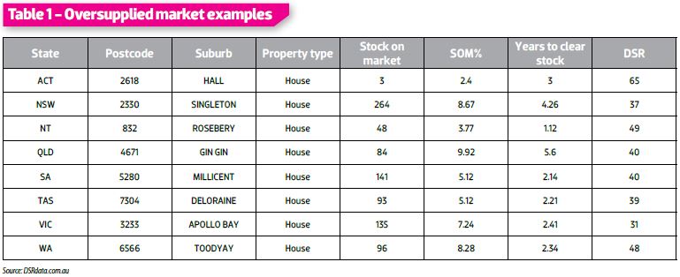
Table 1 lists some examples of oversupplied markets. I’ve grabbed one from each state and territory. Canberra didn’t really have a classic example of an oversupplied market. The closest example I could find was Hall houses.
Stock on market
Stock on market (SOM) is the number of properties for sale. The SOM is usually quite large in an oversupplied market. However, this figure can be deceptively low for small markets and deceptively high for large markets. So a better indicator is the percentage of SOM.
Percentage of stock on market
The percentage of stock on market, or the SOM%, is the number of properties for sale relative to the number of properties in the suburb. Usually SOM% is less than 1%. In fact, the average for Australia at the end of October 2015 was 0.84%. The vast majority of property markets will have an SOM% of less than 2.5%. Anything above 2.5% can be considered ‘abnormal’ and therefore worrying.
Years to clear stock
The ‘years to clear stock’ figure indicates how long it might take to sell all properties currently listed for sale. This figure is based on how many sales took place last year and how many properties are currently for sale. It won’t literally take 2.4 years to sell a property in Apollo Bay, as seen in Table 1. Most sellers won’t wait that long. Instead they’ll lower their asking prices to entice buyers. This is precisely what triggers prices to fall.
DSR
The DSR, or Demand to Supply Ratio, combines a number of key indicators like auction clearance rates, vacancy rates, online search interest (OSI) and plenty of others. It combines them into a score out of 100 for the demand relative to supply. A score of 50 is about the balance point. To place this in context, see Chart 1 below.
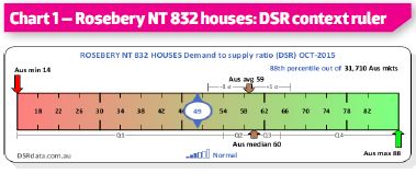
The average DSR countrywide for October was 59 and the median was 60. As you can see, supply is outpacing demand in the Rosebery housing market. This is not a good place to invest for capital growth. Note that there are worse markets than this, however. The lowest DSR for October was 14. Ouch!
Table 1 contains markets with a high supply of property, so you’d expect their DSRs to be quite low. But supply is not the only factor at play. Remember that demand is the other side of the equation.
In other words, a market might have a hefty supply of properties, but if the demand is sufficient it will soak up enough stock to maintain a reasonable degree of balance. Unfortunately, according to the DSR of 49, the demand is just not enough for Rosebery.
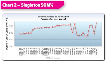
Singleton’s stock on market has been quite high for a while now, as Chart 2 shows. But there has been a steady worsening of this situation for most of the last three years.
A change in the way SOM% is calculated happened in late 2014. A trade-off for this greater accuracy, however, is now greater volatility. This is to be expected since the number of properties for sale each month can vary significantly.
But the chart still shows a problem in this market in terms of supply. It looks like the problem reduced in the early part of 2015 but started increasing again towards the end of the year.
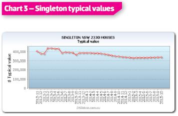
The typical value of a house in Singleton has not risen in the last three years. In fact, prices have fallen in that time by about 15%. This has to happen to make the houses more appealing to buyers. That increased demand for cheaper housing will balance out with the supply and eventually the market will return to normal growth rates. But it can take a long time.
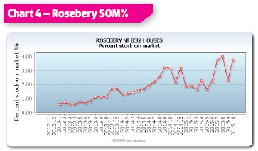
An oversupply doesn’t always mean a price drop. It can just mean no growth for a long time. Chart 4 shows that Rosebery houses had a decent SOM% a few years ago. But a combination of factors has led to an increase in SOM% over that time.
• Firstly, hard work by overeager developers trying to cash in on the Darwin market of yesteryear has taken effect. Remember that it takes a long time to find a suitable site to develop, then negotiate a price and buy, apply to council, wait for approval, and finally build. In that time the market may have moved.
• Secondly, a depressed economy dependent on resources has forced some residents to move elsewhere. A significant portion of Darwin’s workforce was originally there for the massive resource projects.
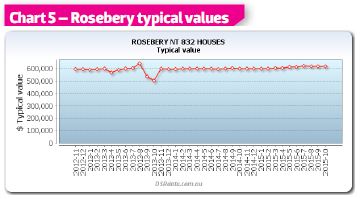
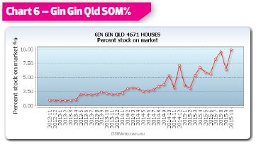
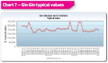
Chart 7 shows the effect this high rise in SOM% is having on prices.
Statistical anomalies
By now you should have a pretty good idea of what an obviously oversupplied market looks like by using just a couple of simple indicators. But here’s the thing with statistics: you should never completely rely on any single figure – they do suffer from time to time at the hands of anomalies in the underlying data.
Both the SOM% and the ‘years to clear stock’ are dependent on having an accurate figure for the number of properties currently listed for sale. This is usually a simple count of properties on ‘for sale’ listing portals like RealEstate.com.au or Domain.com.au.
However, a developer might be selling a complex of units containing six one-bedroom units, 40 two-bedroom units and two three-bedroom units. This is 48 units in total.
But the listing site may only show a single sample one-bedroom unit, a sample two-bedroom unit, and a sample penthouse three-bedroom unit. In this case, the count of properties for sale would be only three. But we know there are actually 48.
Looking at one statistic in isolation – for example the turnover in sales per year, or the number of properties for sale, or the percentage SOM – will expose an investor to the risk of statistical anomalies. Instead, investors should look at multiple statistics. If all are pointing in the same direction, then you can be more confident of investing in that market.
Extra stats to play it safe
Following are some extra indicators you can use to gauge demand relative to supply:
Days on market (DOM) - This is the number of days a property spends listed for sale. If properties are being snapped up quickly by eager buyers, then demand might exceed supply.
Discounting – This is the difference between the original listing price and the eventual sale price. If buyers are eager, sellers don’t need to drop their asking price much.
Online search interest (OSI) – This is the number of online searches for property divided by the number of properties available. A high number means there are more buyers than sellers in the market.
Auction clearance rates (ACR) – This is the percentage of auctioned properties that sell. A high figure means there is fierce bidding.
Percentage of properties sold by auction – Real estate agents know when the market suits auctions: it’s when demand exceeds supply. So a high proportion of sales listed by auction is an indicator of a market in which demand might exceed supply.
There are plenty more indicators than these. The more you can get your eyes on the better, so long as you interpret them correctly, for example population growth is a tricky one.
Undersupplied markets
Now for the good stuff. Table 2 (opposite page) shows a list of undersupplied markets.
The figures in Table 2 are radically different from those in Table 1. A couple of notes:
• Firstly, there was no clearly undersupplied market with decent reliable data I could find in the NT.
• Secondly, there are many markets across Australia in which nothing at all is for sale. But I thought those markets would be a little boring to look at, especially if you can’t even buy there. So I left those out.
• Thirdly, look at how different the DSR is for undersupplied markets versus oversupplied. The average DSR for Table 2 is 66 out of 100. But the average for Table 1’s oversupplied markets was 44 out of 100. And this is taking into consideration some markets like ACT and NT which don’t quite fit the stereotype.
Salamander Bay NSW analysis
Salamander Bay is near Nelson Bay, which is just north of Newcastle. Chart 8 shows the SOM% for Salamander Bay units.
From a low base (less than 1%), the stock on market has dropped even further over the last three years, down to about only one in a thousand properties for sale. The effect on prices can be seen in Chart 9.
From trough to peak, the price growth in just over two years has been nearly 40%. And if the supply side of the equation is all we have to go by, there is plenty more growth to come.
There’s one other interesting point to note from all these charts. The biggest cause of oversupply in well-populated markets is heavy developer activity. As I mentioned before, developers don’t build old stock. And since new stock is always more expensive than comparable older stock, what you’ll usually see when developers get hectic is a rise in the median.
But this is not capital growth – this is median growth. In fact, the extra supply of developer activity could actually create negative growth despite medians rising. So, some of the price charts I’ve shown may not accurately indicate the true fall in values. This will be the case especially if the cause of oversupply was heavy developer activity rather than abandonment of existing stock.
But the price chart for Salamander Bay is unlikely to be biased by a higher proportion of new stock. This is because the very low SOM% suggests that there is no heavy developer activity. So there is more chance this growth is genuine growth, not a statistical anomaly caused by medians.
In summary
There are numerous indicators of market supply and indicators of demand as well. Rather than rely on one in isolation, be sure to check as many as you can. And be sure to check historical charts to roughly gauge a line of best fit instead of simply swallowing the figures for the last month. Don’t be lured into a developer’s web of deceit. Pierce their clever marketing division’s spell-casting with some pointy numbers. Then use those numbers to find better places to invest.

