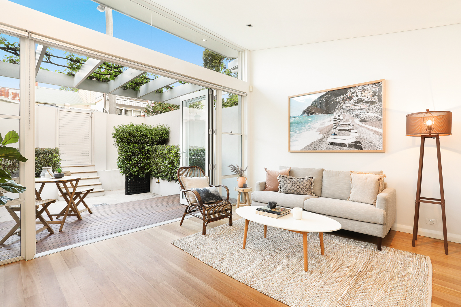
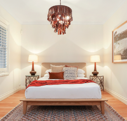
When it comes to property, visuals say it all. The first impression is likely to be the only impression you might make on a possible buyer or renter, so it’s vital to put your best foot forward and show that your property is worth it.
For a relatively small investment, you could see your final sale price swell by tens of thousands of dollars. So, what are the rules for getting it right?
“The main aim of styling an investment property is to make the property look like it’s more valuable. By setting the stage, so to speak, you are creating a picture of perceived value,” says Majestic Home Styling CEO Cheryl Bedford.
Bedford points out that property styling is not just something you turn to when looking to sell – it can also have an effect on your ability to build your investment portfolio.
“Property styling is a must when you have the bank come out to do a valuation on your property. The perceived value can make all the difference to whether you can increase the valuation in order to take out more equity in the property and buy another one.”
Styling is not just about putting some pretty furniture in a room and calling it a day. To do the best job you need to adhere to certain rules as well, and we lay out the dos and don’ts for you here.
DO
1. Do create a narrative
For Bedford, property styling is “all about setting the picture to tell a story about the property”. So, prior to styling, you need to think about what message you want the styling to convey, based on the demographic you want to attract.
“A tenant will pay a higher rent for a property that is perceived to be more of a luxury property,” Bedford points out.
While this doesn’t mean that your property should have expensive fixings, it does suggest that an elegant, classy vibe is generally the way to go.
2. Do consider the size of the space
How big is your property? The answer to this question will impact on your narrative. For example, small spaces should be opened up to make them look bigger, so eschew the gothic vibe.
“Darker furniture also encroaches on a room and makes it feel cluttered. Heavy curtains can make a home look too dark, gloomy and drab,” Bedford explains.
Aim to maximise natural light as much as you can to brighten up a room and create an illusion of space.
3. Do tailor to the market
You should always style to suit the taste of the target demographic. This means that if you’re aiming to attract a family, it’s best to go for a look that caters to what they need to see, like a child’s bedroom.
“Only 5% of people can visualise what you can do with an empty space, and most people think an empty room looks smaller than it is. By staging every room in the house, you can show buyers how areas can be used best,” Bedford says.
Adding a personal touch here and there makes the property look more appealing and can help a visitor better envision it as their own home.
“Perceived value can make all the difference to whether you can increase the valuation in order to take out more equity in the property and buy another one”
4. Do clean up
Regardless of how you choose to doll up your home for sale, cleanliness is crucial. You may have beautiful furniture and great lighting, but if that highlights dirt and grime, expect buyers to write the property off.
And by cleaning we don’t just mean dusting off the cabinets – it also involves organising the space overall so that it looks neat. Sometimes you don’t even need to make massive style changes – a sprucing up will do the trick!
DON'T
1. Don’t accessorise poorly
This goes back to knowing how much space you are working with. The furniture you choose to showcase should not create unnecessary clutter and make a room feel smaller than it is. Rather, its size should be appropriate to the room, leaving enough space for you and your guests to walk through comfortably.
It’s also wise to avoid using heavy, dark material for your curtains, as this can make a home look dark and gloomy.
2. Don’t interrupt the flow
Flow is such an important aspect of a home. Rooms need to lead easily into one another, and the entire property should feel connected as a whole, even if each space has its own function.
Breaking this flow is like putting on a mismatched outfit – it’s jarring and distracts a visitor with minor details. Unfortunately, it can be quite easy to make this mistake.
“The misplacement of furniture can stop the natural flow of the house,” Bedford warns.
“Only 5% of people can visualise what you can do with an empty space, and most people think an empty room looks smaller than it is”
Ultimately, you want to arrange furniture so the paths to other rooms aren’t blocked. You should also ensure that the styling of one room isn’t drastically different from the look of the next, and that there’s a common theme bringing it all together.
3. Don’t forget the external
Styling a home doesn’t stop with the interiors; buyers and renters look at the outside of your property as well. You don’t need to do much – just ensure that your front yard is neat and aesthetically pleasing.
“Mow the lawns, put fresh mulch on the garden beds, and add a splash of colour with some flowering plants near the front door,” Bedford advises.
4. Don’t ignore what needs repair/replacement
It can be tempting to let damage to the property slide, especially when you’re looking to sell your home, which makes it someone else’s problem. But note that disrepair brings down the value of the property, which means all styling efforts go to waste in the end.
Bedford points out that repairs and replacements don’t have to be expensive.
“If the window furnishings are not in excellent condition, replace them. You can do this for a small investment as most home department stores sell off-the-shelf, ready-to-hang curtains and blinds,” she says.
“If a carpet looks tired, seriously consider replacing it. It doesn’t cost a lot, and it makes a significant impact on the final result.”
HOME STYLING CASE STUDIES
Rachel Sillato of iStyle Property Styling walks us through the styling of two very different properties

PROPERTY 1: LEICHHARDT, NSW
Styling budget: $5,000 | Approx. value added: $70,000
Styling can require minimal effort – and some cleaning up of the existing space can deliver excellent results.
“We were inspired by the light-filled interior spaces throughout the property, the contemporary kitchen and sophisticated finishes,” Sillato says.
The team exchanged the existing flooring for a plush new carpet on the upper gallery level, while the blackbutt hardwood floors on the lower level were sanded and polished. The gardens were manicured to create an attractive facade.
“The built-in storage located in most rooms meant a more minimalist amount of furniture was required. The interior’s light colour palette provided a flexible canvas to work with,” Sillato explains.
Lighting also went a long way in giving the property a more modern feel.
“We felt that the silver and glass chandelier in the entrance master bedroom could be updated to reflect more current interior trends, so we replaced it with a gorgeous leather pendant light,” she says.
“Lighting is very transformative and one of the most cost-effective secret weapons for maximising profit when selling!”
PROPERTY 2: ARTARMON, NSW
Styling budget: $7,500 | Approx. value added: $100,000
This family-sized home had recently undergone a modest renovation, which included a new kitchen, new paint for both the interiors and the exterior, freshly sanded and polished floors, and a new plush carpet in the bedrooms,” Sillato says.
The size of the property meant that she had to take care in selecting the right furniture to keep it from looking too bare.
“Many of the rooms were generous in size, which meant the correct scale of furniture needed to be considered for inclusion. Ensuring that the end result reflected a spacious yet well-furnished property was our focus,” Sillato explains.
The vastness of the property wasn’t a major problem for the team, as they put the space to good use.
“In addition to the large living room with period features at the front of the home, we also created a more relaxed family room in the large open-plan family and meals area located towards the rear,” she says.
“With ample sunlight streaming through this space, it provided a great opportunity to showcase the concertina glass doors opening onto the large entertainer’s deck.”
Sillato also used nature to create an enticing atmosphere.
“Inspired by this property’s location, we chose an interior design colour palette that was complementary to the natural setting and one that would create feelings of warmth and calmness for the potential buyer viewing the property.”
